How to set it up?
Mural is a cloud-based tool used by trainers to deliver online workshops, by companies to test and develop their innovation processes, and by educational institutions to teach. Recently, they also added a Mural app, which works on iOS and Android. Check out their technical requirements.
It is a complex tool that takes some time to grasp but has a considerable base to help us. It offers tips on how to run online workshops and many ideas for activities. To explore key features, we can check YouTube videos or choose one of the Mural courses.
If we start preparing engaging canvases from scratch, we will likely spend a lot of time on it. But the beauty of Mural is that it offers a lot of pre-made templates that can reduce the time we need to prepare for the activity you’ll be hosting online.
There is a possibility of adding post-it notes, pictures, and icons from a sidebar menu. You can also use the drag-and-drop feature to upload elements from your computer.
Shortcuts for navigating a mural
Moving around the Mural got easier by adding the option to move with arrow keys. To move around your canvas with ease, use these keyboard shortcuts. You can access the shortcut key anytime under the Mural’s question mark (?) icon.
Move around the Mural: ARROW KEYS
Move around the Mural faster: SHIFT + ARROW KEYS
Pan without moving elements: Hold SPACEBAR + Drag
Zoom in: Z + Marquee
Select part of Mural: Z + Click
Zoom out: ALT + Z + marquee select part of Mural
Fit to content: SHIFT + CTRL + 0
Actual size: CTRL + ALT + O
Pop-up an element: X + Hover element
To make sure you offer the best experience, you can check out the best practices for better performance.
How to use it in practice?
The Mural is a collaborative tool with many applications; it can replace posters, post-it notes, and PowerPoint presentations, making the process more dynamic, creative, and visually appealing.
It is less user-friendly because of its complexity than other, more straightforward tools. Therefore, it works best for longer and more complex planning or creative processes.
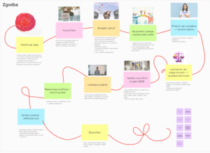
For example, it can be used by youth groups in the planning phase of an initiative or project when, for one reason or another, face-to-face meetings are not possible. The Mural’s functions allow the creation of a clear and attractive visualization of the project idea. It enables storing important information, brainstorming, voting on desired topics, attaching various links, and even creating a visual presentation for potential funders and other stakeholders.
If we use it for the first time, we need to give users some time right from the start to get to grips with the tool. To do this, we can provide them with a preparation activity where they have to create something in Mural before the workshop, or we can set aside some time to play around and get to know the tool.
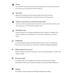
 When we invite participants into the Mural, and they start moving around the canvas we have created, it can happen that the elements on the canvas suddenly start moving. This is the case if we don’t lock them. It is essential to double-check if all the components are locked to ensure they stay in place.
In large groups, it also happens every now and then that someone inside the tool wanders off. They start exploring independently, or they get lost, in which case Mural allows us to “call” (Summon feature) the participant to rejoin the group.
The Mural visualizations will impress, but simultaneously, thier variety may capture too much attention. In such cases, we use a feature to hide all those elements we don’t need and leave only the ones we want to be visible, thus diverting users’ attention to them.
What are good practice examples?
 The Mural can be used as a content container (storing all the information) in longer creative processes or training. Within the Incubator 4.0 project, we have started designing an escape room. As the pandemic prevented us from gathering, we transferred the content of the posters into the Mural tool. We used the creation of a personal ID card as an icebreaker at the beginning of the online planning, and through this, we got to know the essential functions of the Mural tool. This activity was followed by preparing a visual representation of the storyline, a puzzle board, and the floor plan design of the physical space in which we later set up the escape room.
With the Mural tool, we can support various activities like workshops and consultations. One of our favorite ones is a consultation with young people regarding the youth center, where we combined Zoom for video calls and Mural to visualize the youth center’s floor plan. The municipality proposed the location, and young people tried to prepare a design that would enable them to cover all their needs regarding the potential uses.
The other one is a workshop for future-to-be youth workers, where we used Mural for presentation and activities, which enabled us to use only one tool for the whole workshop. We checked in with Dixit card pictures, hosted diverse group activities (ex., brainstorming and idea voting), and presented a short theoretical part.
What are its features that support inclusion?
Acting like a tour guide: We need to take the time to introduce them to important features and site navigation as well as share access to keyboard shortcuts. These can make navigation easier for some.
Be clear with our message: We need to aim for 8th-grade level language and create a clear outline. Using the outline function of our mural makes it easier for collaborators to follow along with our journey.
We should limit the toolbar in our mural so it only shows the tools needed for our session. We can hide the cursors and even disable reactions, so there’s less distraction.
Using an accessible sans-serif font (such as ABC Social, which is Mural’s default font) for ease of readability.
Selecting colors that have a proper color contrast ratio with their related text.
Images and GIFs cause input overload. Also, we need to make sure to add captions and descriptions to images.
For links in our mural, we must use descriptive language to explain what a link does. For example, “click this link to take the survey” instead of “click here.”
We provided some basic tips and tricks, but you can explore more in blogs Accessibility best practices for Mural facilitators and Accessibility features in Mural.
What are alternatives?
There are many alternatives to Mural, including Miro, ClickUp, Conceptboard, Lucidspark, etc. Mural and Miro are the most used in the wider educational community. When choosing the best, you must check their features and decide what’s best based on your needs. The Mural tool is better if you use murals for workshops with people who don’t know whiteboard tools so well, as it has fewer tools, but they are diverse enough to cover most of your needs.
